Glassbreakers
Visual / Brand
- Visual Design
- Art Direction
- Brand Strategy
Objective
As the only designer on the team, it was my responsibility to create any graphic assets, icons, and any visual-related media. My challenge was to develop a language that communicated a sense of warmth and community while also having a sense of being a secure, enterprise platform.
Approach
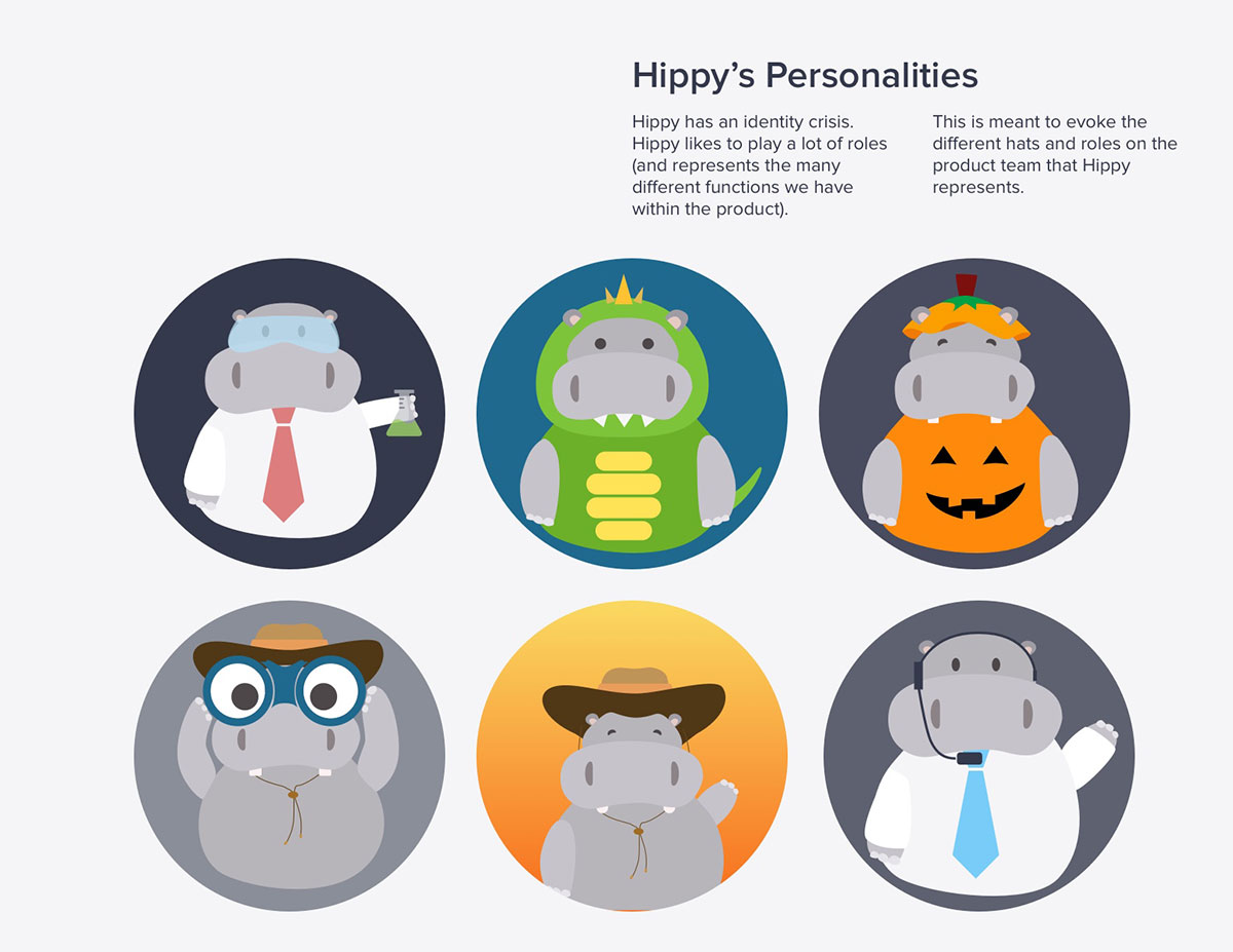
We needed to create consistency across our other channels especially for language in marketing, emails, and the product voice. One strategy we used for creating a more empathic voice for our platform was to create Hippy, a friendly hippo, as our support persona.
One project was a potential rebrand to help users differentiate the platform from the previous version and the existing social media associated with the name. This constituted a logo and name rebrand, a revised color scheme, and a change in the product language.
Process
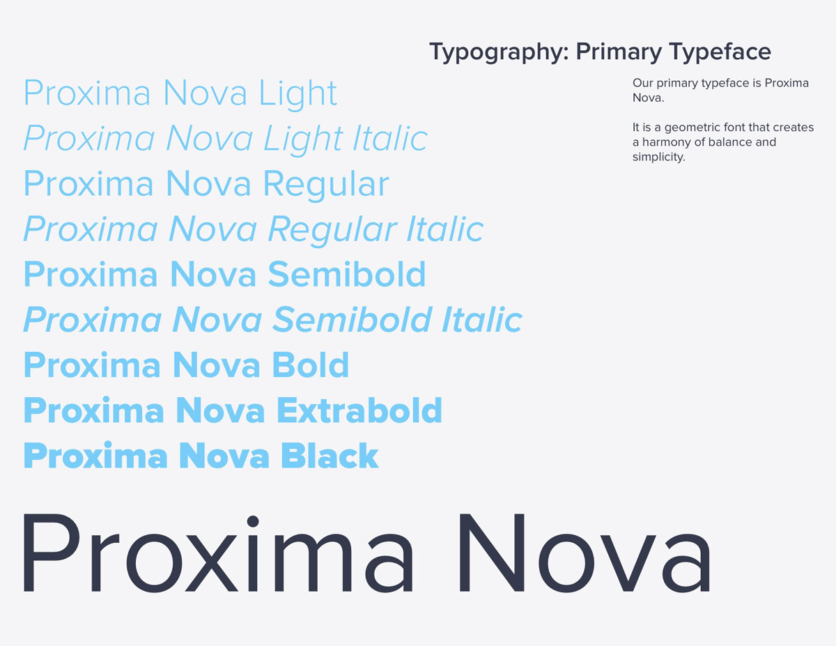
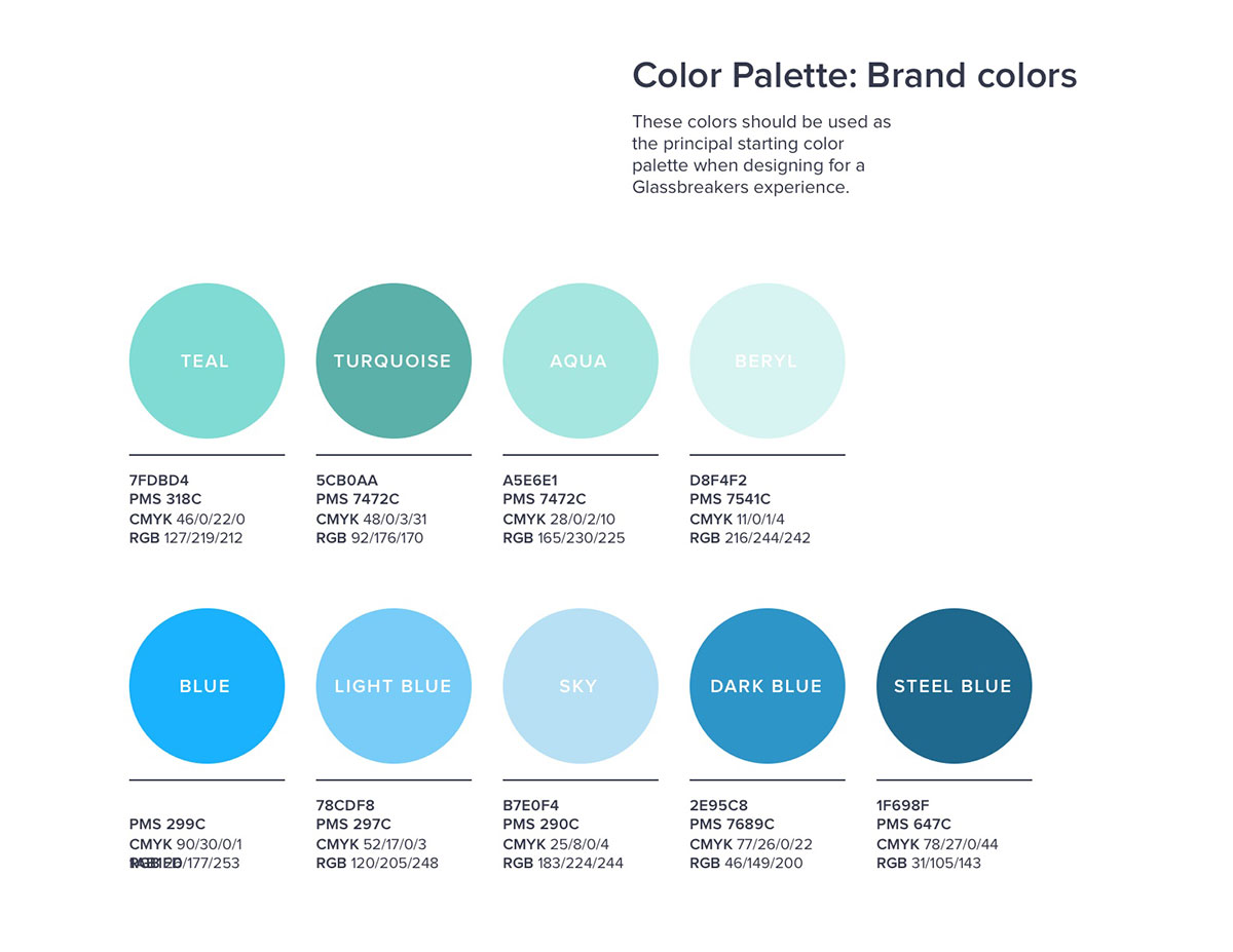
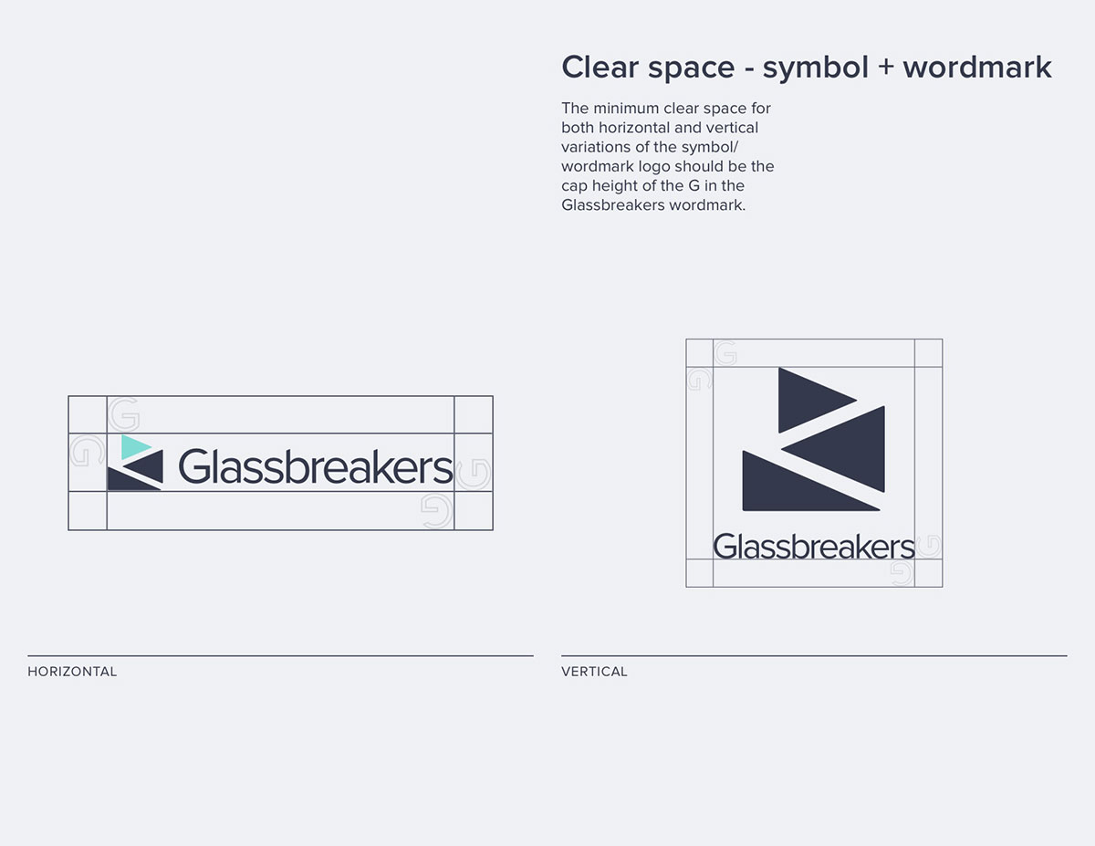
The style guide was the first step to create a common language between design and engineering, but we also developed brand and tone guidelines to outline the product voice to our users.
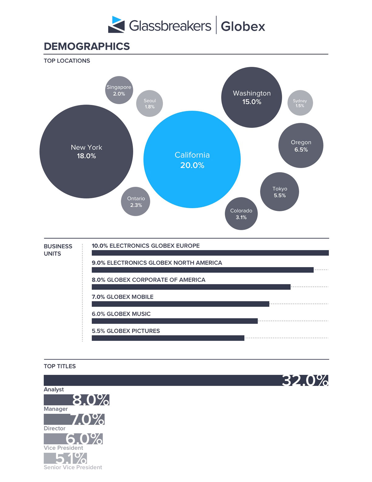
On top of platform designs, I also worked on any presentational deliverables such as analytics reports and presentation decks.